Standard Hero
We use heroes to show our most important content and grab the user's attention in a visual way. Heroes are positioned at the top of the page to lead the additional POV and content for the rest of the page.
The Standard Hero represents the usual visual treatment for heroes.
Playground
Default (half-and-half)
By default, the Standard Hero will place the text alongside the hero image. If you want to change the color underneath the text, you can use the background color feature.
optional eyebrow
Heading
An optional footnote can go below the button.
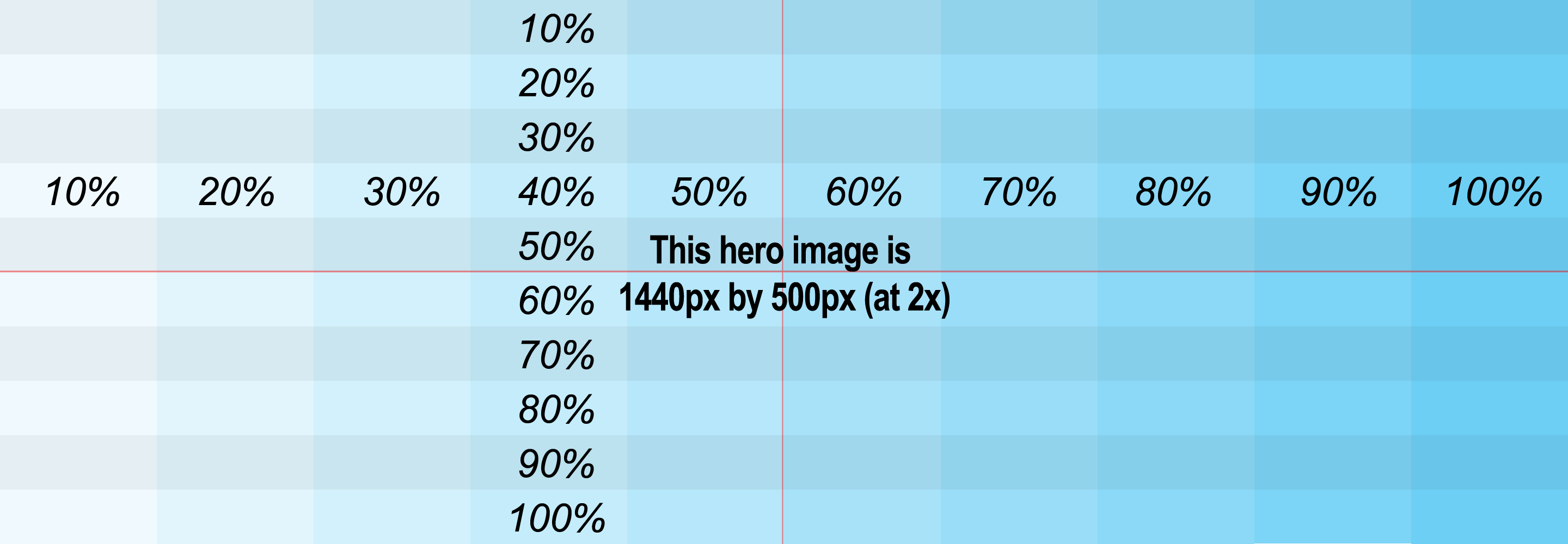
<StandardHero><StandardHeroTextContainer><StandardHeroText><StandardHeroTextInner><StandardHeroEyebrow>optional eyebrow</StandardHeroEyebrow><StandardHeroHeading>Heading</StandardHeroHeading><StandardHeroDescription>The Standard Hero Description goes right below the heading.</StandardHeroDescription><StandardHeroCTA><TextButton>CTA button</TextButton></StandardHeroCTA><StandardHeroFootnote>An optional footnote can go below the button.</StandardHeroFootnote></StandardHeroTextInner></StandardHeroText></StandardHeroTextContainer><StandardHeroImageContainer><StandardHeroImage><FluidImagesrc="https://visage-design-system.prod.merch.vpsvc.com/latest/v5/all/images/hero-responsive-placeholder.png"alt="Placeholder"/></StandardHeroImage></StandardHeroImageContainer></StandardHero>
<div class="standard-hero"><div class="standard-hero-text-container"><div class="standard-hero-text"><div class="standard-hero-text-inner"><div class="standard-hero-heading">Heading</div><div class="standard-hero-description">The Standard Hero Description goes right below the heading.</div><div class="standard-hero-cta"><button class="textbutton textbutton-skin-secondary" type="button">CTA button</button></div><p class="standard-hero-footnote">An optional footnote can go below the button.</p></div></div></div><div class="standard-hero-image-container"><div class="standard-hero-image"><imgclass="fluid-image"src="https://www.picsum.photos/800/300?id=right"alt="Placeholder"/></div></div></div>
If there are multiple calls to action, you can add multiple buttons, but they should use the "mini" height.
Heading

<StandardHero><StandardHeroTextContainer><StandardHeroText><StandardHeroTextInner><StandardHeroHeading>Heading</StandardHeroHeading><StandardHeroDescription>The Standard Hero Description goes right below the heading.</StandardHeroDescription><TextButtoncomponent={StandardHeroCTA}skin="secondary"sizeVariant="mini">CTA 1</TextButton><TextButtoncomponent={StandardHeroCTA}skin="secondary"sizeVariant="mini">CTA 2</TextButton><TextButtoncomponent={StandardHeroCTA}skin="secondary"sizeVariant="mini">CTA 3</TextButton></StandardHeroTextInner></StandardHeroText></StandardHeroTextContainer><StandardHeroImageContainer><StandardHeroImage><FluidImagesrc="https://visage-design-system.prod.merch.vpsvc.com/latest/v5/all/images/hero-responsive-placeholder.png"alt="Placeholder"/></StandardHeroImage></StandardHeroImageContainer></StandardHero>
For responsiveness, you can replace the Fluid Image inside StandardHeroImage with a <picture> tag. The fallback image inside the <picture> should then be a Fluid Image.
Heading

<StandardHero><StandardHeroTextContainer><StandardHeroText><StandardHeroTextInner><StandardHeroHeading>Heading</StandardHeroHeading><StandardHeroDescription>The Standard Hero Description goes right below the heading.</StandardHeroDescription><StandardHeroCTA><TextButton>CTA button</TextButton></StandardHeroCTA></StandardHeroTextInner></StandardHeroText></StandardHeroTextContainer><StandardHeroImageContainer><StandardHeroImage><picture><sourcesrcset="https://visage-design-system.prod.merch.vpsvc.com/latest/v5/all/images/hero-responsive-placeholder.png"media="(min-width: 800px)"/><FluidImagesrc="https://visage-design-system.prod.merch.vpsvc.com/latest/v5/all/images/hero-responsive-placeholder.png"alt="Placeholder"/></picture></StandardHeroImage></StandardHeroImageContainer></StandardHero>
Full Width Image
Most of our heroes use a single background image that covers the entire hero (rather than the "side-by-side" look we used to use, and which is now deprecated.)
Use the "full width image" option for heroes that use a single full image with text overlaid, rather than the side-by-side look.
Heading
An optional footnote can go below the button.

<StandardHero fullWidthImage><StandardHeroTextContainer><StandardHeroText><StandardHeroTextInner><StandardHeroHeading>Heading</StandardHeroHeading><StandardHeroDescription>The Standard Hero Description goes right below the heading.</StandardHeroDescription><StandardHeroCTA><TextButton>CTA button</TextButton></StandardHeroCTA><StandardHeroFootnote>An optional footnote can go below the button.</StandardHeroFootnote></StandardHeroTextInner></StandardHeroText></StandardHeroTextContainer><StandardHeroImageContainer><StandardHeroImage><FluidImagesrc="https://visage-design-system.prod.merch.vpsvc.com/latest/v5/all/images/hero-responsive-placeholder.png"alt="Placeholder"/></StandardHeroImage></StandardHeroImageContainer></StandardHero>
<div class="standard-hero standard-hero-full-width-image"><div class="standard-hero-text-container"><div class="standard-hero-text"><div class="standard-hero-text-inner"><div class="standard-hero-heading">Heading</div><div class="standard-hero-description">The Standard Hero Description goes right below the heading.</div><div class="standard-hero-cta"><button class="textbutton textbutton-skin-secondary" type="button">CTA button</button></div><p class="standard-hero-footnote">An optional footnote can go below the button.</p></div></div></div><div class="standard-hero-image-container"><div class="standard-hero-image"><imgclass="fluid-image"src="https://www.picsum.photos/800/300?id=right"alt="Placeholder"/></div></div></div>
Text Alignment
Horizontal Alignment
The box that holds the the text defaults to a left-hand alignment.
A default (side-by-side) hero can use text alignment to swap the text box and the image, so that the image is on the left and the text is on the right.
A "full width image" hero uses the same properly to make the text box align to the right, or be centered.
Heading

<StandardHero fullWidthImage textAlign="center"><StandardHeroTextContainer><StandardHeroText><StandardHeroTextInner><StandardHeroHeading>Heading</StandardHeroHeading><StandardHeroDescription>This hero is aligning its text to the center.</StandardHeroDescription><StandardHeroCTA><TextButton>CTA button</TextButton></StandardHeroCTA></StandardHeroTextInner></StandardHeroText></StandardHeroTextContainer><StandardHeroImageContainer><StandardHeroImage><FluidImagesrc="https://visage-design-system.prod.merch.vpsvc.com/latest/v5/all/images/hero-responsive-placeholder.png"alt="Placeholder"/></StandardHeroImage></StandardHeroImageContainer></StandardHero>
<StandardHero fullWidthImage textAlign="center" />
<divclass="standard-hero standard-hero-full-width-image standard-hero-text-center">...</div>
Note for the (now-deprecated) Standard Hero that doesn't use the "full width image" option:
Aligning the text to the right will actually swap the text panel with the image panel, thus positioning the text on the right side of the hero and the image on the left.
Vertical Alignment
For a "full width image" hero, the box that holds the the text also defaults to being vertically centered. You can adjust this so that the box sits aligned to the top or bottom.
Heading

<StandardHero fullWidthImage textVerticalAlign="bottom"><StandardHeroTextContainer><StandardHeroText><StandardHeroTextInner><StandardHeroHeading>Heading</StandardHeroHeading><StandardHeroDescription>This hero is aligning its text box to the bottom.</StandardHeroDescription><StandardHeroCTA><TextButton>CTA button</TextButton></StandardHeroCTA></StandardHeroTextInner></StandardHeroText></StandardHeroTextContainer><StandardHeroImageContainer><StandardHeroImage><FluidImagesrc="https://visage-design-system.prod.merch.vpsvc.com/latest/v5/all/images/hero-responsive-placeholder.png"alt="Placeholder"/></StandardHeroImage></StandardHeroImageContainer></StandardHero>
<StandardHero fullWidthImage textVerticalAlign="bottom" />
<divclass="standard-hero standard-hero-full-width-image standard-hero-text-align-bottom">...</div>
Text Background
You can set the background of the text box to be transparent.
Heading

<StandardHero fullWidthImage textBackground="transparent"><StandardHeroTextContainer><StandardHeroText><StandardHeroTextInner><StandardHeroHeading>Heading</StandardHeroHeading><StandardHeroDescription>Description</StandardHeroDescription><StandardHeroCTA><TextButton>CTA button</TextButton></StandardHeroCTA></StandardHeroTextInner></StandardHeroText></StandardHeroTextContainer><StandardHeroImageContainer><StandardHeroImage><FluidImagesrc="https://visage-design-system.prod.merch.vpsvc.com/latest/v5/all/images/hero-responsive-placeholder.png"alt="Placeholder"/></StandardHeroImage></StandardHeroImageContainer></StandardHero>
<StandardHero fullWidthImage textBackground="transparent" />
<divclass="standard-herostandard-hero-full-width-imagestandard-hero-text-transparent-background"></div>
Or you can use a skin to change the background color of the text box. The "holiday" skin will set the box (and the text within it) to use holiday colors:
Heading

<StandardHero fullWidthImage skin="holiday"><StandardHeroTextContainer><StandardHeroText><StandardHeroTextInner><StandardHeroHeading>Heading</StandardHeroHeading><StandardHeroDescription>Description</StandardHeroDescription><StandardHeroCTA><TextButton>CTA button</TextButton></StandardHeroCTA></StandardHeroTextInner></StandardHeroText></StandardHeroTextContainer><StandardHeroImageContainer><StandardHeroImage><FluidImagesrc="https://visage-design-system.prod.merch.vpsvc.com/latest/v5/all/images/hero-responsive-placeholder.png"alt="Placeholder"/></StandardHeroImage></StandardHeroImageContainer></StandardHero>
<StandardHero fullWidthImage skin="holiday" />
<divclass="standard-hero standard-hero-full-width-image standard-hero-skin-holiday">...</div>
Hide Image on Mobile
The "hide image on mobile" option will hide the hero image on mobile (Extra-Small and Small) screens.
Hiding Image on Mobile

<StandardHero fullWidthImage hideImageOnMobile><StandardHeroTextContainer><StandardHeroText><StandardHeroTextInner><StandardHeroHeading>Hiding Image on Mobile</StandardHeroHeading><StandardHeroDescription>This hero has a background image that will be hidden on mobilescreens.</StandardHeroDescription><StandardHeroCTA><TextButton>CTA button</TextButton></StandardHeroCTA></StandardHeroTextInner></StandardHeroText></StandardHeroTextContainer><StandardHeroImageContainer><StandardHeroImage><FluidImagesrc="https://visage-design-system.prod.merch.vpsvc.com/latest/v5/all/images/hero-responsive-placeholder.png"alt="Placeholder"/></StandardHeroImage></StandardHeroImageContainer></StandardHero>
Image Behind Text on Mobile
By default, on mobile, the Hero will display in a column, first the text and then the image. The "image behind text on mobile" option will cause a "full-width" Hero to instead keep the image behind the text.
Image behind text on mobile

<StandardHerofullWidthImagetextBackground="transparent"imageBehindTextOnMobile><StandardHeroTextContainer><StandardHeroText><StandardHeroTextInner><StandardHeroHeading>Image behind text on mobile</StandardHeroHeading><StandardHeroDescription>This hero will keep showing the image behind the text, even on mobilescreens. (This hero is also using the option for a transparent textbackground.)</StandardHeroDescription><StandardHeroCTA><TextButton>CTA button</TextButton></StandardHeroCTA></StandardHeroTextInner></StandardHeroText></StandardHeroTextContainer><StandardHeroImageContainer><StandardHeroImage><FluidImagesrc="https://visage-design-system.prod.merch.vpsvc.com/latest/v5/all/images/hero-responsive-placeholder.png"alt="Placeholder"/></StandardHeroImage></StandardHeroImageContainer></StandardHero>
"Short" heroes
The "short" option will make the hero shorter than normal, reducing the spacing around the text box, so that more content fits into less vertical space.
Heading

<StandardHero fullWidthImage height="short"><StandardHeroTextContainer><StandardHeroText><StandardHeroTextInner><StandardHeroHeading>Heading</StandardHeroHeading><StandardHeroDescription>Description</StandardHeroDescription><StandardHeroCTA><TextButton>CTA button</TextButton></StandardHeroCTA></StandardHeroTextInner></StandardHeroText></StandardHeroTextContainer><StandardHeroImageContainer><StandardHeroImage><FluidImagesrc="https://visage-design-system.prod.merch.vpsvc.com/latest/v5/all/images/hero-responsive-placeholder.png"alt="Placeholder"/></StandardHeroImage></StandardHeroImageContainer></StandardHero>
<StandardHero fullWidthImage height="short" />
<div class="standard-hero standard-hero-full-width-image standard-hero-short">...</div>
with Left Hand Navigation
This combination places a Left Hand Navigation component over part of the hero, spilling over into the area below the hero. The content below the hero is then shifted over to accommodate the left-hand navigation.
This combination is designed to work only with the hero text just to the right of the left nav, and with that text left-aligned. The hero can use either the "full width image" option (with the text overlaid on top of the image) or the default "side-by-side", with the text adjacent to the image.
Note also that the left-hand navigation will be hidden on Extra-Small screens.
Hero With Left Hand Nav

Here is the content that goes below the hero.
<><StandardHero withNav backgroundColor="medium-yellow"><LeftHandNavigation><LeftHandNavigationHeader>Left-Hand Nav Heading</LeftHandNavigationHeader><Divider /><LinkList><ListItem>Item 1a</ListItem><ListItem>Item 2a</ListItem><ListItem>Item 3a</ListItem><ListItem>Item 4a</ListItem><ListItem>Item 5a</ListItem></LinkList><Divider /><LinkListHeading>Link list heading</LinkListHeading><LinkList><ListItem>Item 1b</ListItem><ListItem>Item 2b</ListItem><ListItem>Item 3b</ListItem><ListItem>Item 4b</ListItem><ListItem>Item 5b</ListItem><ListItem>Item 6b</ListItem><ListItem>Item 7b</ListItem><ListItem>Item 8b</ListItem><ListItem>Item 9b</ListItem><ListItem>Item 10b</ListItem><ListItem>Item 11b</ListItem></LinkList></LeftHandNavigation><StandardHeroTextContainer><StandardHeroText><StandardHeroTextInner><StandardHeroHeading>Hero With Left Hand Nav</StandardHeroHeading><StandardHeroDescription>Hero description goes here.</StandardHeroDescription><TextButton component={StandardHeroCTA} skin="primary">Call to Action</TextButton></StandardHeroTextInner></StandardHeroText></StandardHeroTextContainer><StandardHeroImageContainer><StandardHeroImage><FluidImagesrc="https://visage-design-system.prod.merch.vpsvc.com/latest/v5/all/images/hero-responsive-placeholder.png"alt="Placeholder"/></StandardHeroImage></StandardHeroImageContainer></StandardHero><StandardHeroWithNavContent><Typography component="p">Here is the content that goes below the hero.</Typography><GridContainer><Row><Column span={4}><StandardTile component="a" href="#"><StandardTileImage><FluidImagesrc="https://visage-design-system.prod.merch.vpsvc.com/latest/v5/all/images/hero-responsive-placeholder.png"alt="Placeholder"/></StandardTileImage><StandardTileContents><StandardTileName>Tile name</StandardTileName><StandardTileDescription>This tile has a description.</StandardTileDescription><StandardTileCTA>Create Now</StandardTileCTA></StandardTileContents></StandardTile></Column><Column span={4}><StandardTile component="a" href="#"><StandardTileImage><FluidImagesrc="https://visage-design-system.prod.merch.vpsvc.com/latest/v5/all/images/hero-responsive-placeholder.png"alt="Placeholder"/></StandardTileImage><StandardTileContents><StandardTileName>Tile name</StandardTileName><StandardTileDescription>This tile has a description.</StandardTileDescription><StandardTileCTA>Create Now</StandardTileCTA></StandardTileContents></StandardTile></Column><Column span={4}><StandardTile component="a" href="#"><StandardTileImage><FluidImagesrc="https://visage-design-system.prod.merch.vpsvc.com/latest/v5/all/images/hero-responsive-placeholder.png"alt="Placeholder"/></StandardTileImage><StandardTileContents><StandardTileName>Tile name</StandardTileName><StandardTileDescription>This tile has a description.</StandardTileDescription><StandardTileCTA>Create Now</StandardTileCTA></StandardTileContents></StandardTile></Column></Row></GridContainer></StandardHeroWithNavContent></>
Hero With Left Hand Nav

<><StandardHero withNav fullWidthImage><LeftHandNavigation>(etc. All the other inner pieces of Left Hand Navigation.)</LeftHandNavigation><StandardHeroTextContainer><StandardHeroText><StandardHeroTextInner><StandardHeroHeading>Hero With Left Hand Nav</StandardHeroHeading><StandardHeroDescription>Hero description goes here.</StandardHeroDescription><TextButton component={StandardHeroCTA} skin="primary">Call to Action</TextButton></StandardHeroTextInner></StandardHeroText></StandardHeroTextContainer><StandardHeroImageContainer><StandardHeroImage><FluidImagesrc="https://visage-design-system.prod.merch.vpsvc.com/latest/v5/all/images/hero-responsive-placeholder.png"alt="Placeholder"/></StandardHeroImage></StandardHeroImageContainer></StandardHero><StandardHeroWithNavContent>(etc. The content that goes below the hero, typically inside a GridContainer.)</StandardHeroWithNavContent></>
<divclass="standard-herostandard-hero-full-width-imagestandard-hero-with-left-hand-navigation"><!-- Left Hand Navigation goes first --><!-- then all the other inner pieces of a Standard Hero --></div><div class="bounded-content"><div class="content-below-hero-with-left-hand-navigation"><!-- etc. The content that goes below the hero, typically inside a Grid Container. --></div></div>
Video
You can use a <video> instead of an image inside a Standard Hero., by placing the video tag inside the StandardHeroImage container where the image tag would normally go.
Note that this applies only to videos that act like animating backgrounds, not for videos where the user would want to play/pause the video.
You will need to set the <video> tag to play inline and autoplay; you will likely also want to make it loop. In React, this is <video loop playsInline autoPlay>.
Two Images, with one behind the text (Deprecated)
If you don't use the "full width image" option, you get a version with two images instead of one, where one image goes behind the text; the text has a dark translucent layer under it that will go over that image. This version adds a "hero text background image" sub-component to hold that image, which goes inside the hero text container.
Also, this style of hero allowed up to two optional "highlight" sub-components. These are also no longer part of our current designs.

Heading

<StandardHero><StandardHeroTextContainer><StandardHeroTextBackgroundImage><FluidImagesrc="https://visage-design-system.prod.merch.vpsvc.com/latest/v5/all/images/hero-responsive-placeholder.png"alt="Placeholder"/></StandardHeroTextBackgroundImage><StandardHeroText><StandardHeroTextInner><StandardHeroHeading>Heading</StandardHeroHeading><StandardHeroDescription>Description</StandardHeroDescription><StandardHeroCTA><TextButton>CTA button</TextButton></StandardHeroCTA></StandardHeroTextInner></StandardHeroText></StandardHeroTextContainer><StandardHeroImageContainer><StandardHeroImage><FluidImagesrc="https://visage-design-system.prod.merch.vpsvc.com/latest/v5/all/images/hero-responsive-placeholder.png"alt="Placeholder"/></StandardHeroImage><StandardHeroImageHighlights><StandardHeroImageHighlight>Highlight</StandardHeroImageHighlight><StandardHeroImageHighlight>Another highlight</StandardHeroImageHighlight></StandardHeroImageHighlights></StandardHeroImageContainer></StandardHero>
Components
StandardHero
| Prop | Type | Default | Description |
|---|---|---|---|
| fullWidthImage | boolean | Whether or not the image should take up the full width | |
| narrow | boolean | [DEPRECATED; use a Standard Banner instead] Adjust the hero's layout and typography to better fit a narrow width | |
| skin | "holiday" | "standard" | "inverse" | standard | The visual style of the StandardHero. ["inverse" is DEPRECATED] |
| staggered | boolean | Whether or not the image and text should be staggered | |
| textAlign | "left" | "center" | "right" | "transparent-background" | left | The horizontal alignment of the text In the basic StandardHero (non-fullWidthImage), setting the value "right" will move the image to the left and the text to the right. (Note: "transparent-background" is deprecated; use the "textBackground" prop instead.) |
| textBackground | "standard" | "transparent" | standard | The background of the text |
| textVerticalAlign | "center" | "top" | "bottom" | center | The vertical alignment of the text |
| withNav | boolean | Adjust the hero's layout to fit a left hand navigation menu | |
| hideImageOnMobile | boolean | false | Hide the hero image on mobile |
| imageBehindTextOnMobile | boolean | false | Show the hero image behind the text on mobile |
All other props are forwarded to the element specified in thecomponentprop(default: <component/>)
StandardHeroTextContainer
StandardHeroTextContainer has no props of its own
All props are forwarded to the element specified in thecomponentprop(default: <component/>)
StandardHeroTextBackgroundImage
StandardHeroTextBackgroundImage has no props of its own
All props are forwarded to the element specified in thecomponentprop(default: <component/>)
StandardHeroText
StandardHeroText has no props of its own
All props are forwarded to the element specified in thecomponentprop(default: <component/>)
StandardHeroTextInner
StandardHeroTextInner has no props of its own
All props are forwarded to the element specified in thecomponentprop(default: <component/>)
StandardHeroHeading
StandardHeroHeading has no props of its own
All props are forwarded to the element specified in thecomponentprop(default: <component/>)
StandardHeroDescription
StandardHeroDescription has no props of its own
All props are forwarded to the element specified in thecomponentprop(default: <component/>)
StandardHeroCTA
StandardHeroCTA has no props of its own
All props are forwarded to the element specified in thecomponentprop(default: <component/>)
StandardHeroFootnote
StandardHeroFootnote has no props of its own
All props are forwarded to the element specified in thecomponentprop(default: <component/>)
StandardHeroImageContainer
StandardHeroImageContainer has no props of its own
All props are forwarded to the element specified in thecomponentprop(default: <component/>)
StandardHeroImage
StandardHeroImage has no props of its own
All props are forwarded to the element specified in thecomponentprop(default: <component/>)
StandardHeroImageHighlights
StandardHeroImageHighlights has no props of its own
All props are forwarded to the element specified in thecomponentprop(default: <component/>)
StandardHeroImageHighlight
StandardHeroImageHighlight has no props of its own
All props are forwarded to the element specified in thecomponentprop(default: <component/>)
Guidelines
Designer Guidelines
The height of the hero is normally determined by the height of the text. The product image may be clipped if it is too tall or too wide to fit.
Keep headlines and descriptions short! If the text is too long, it may make the hero awkwardly tall on smaller screens.
Short, wide images (such as the ones used for full-width heroes) may not look great on Extra-Small screens such as phones, and the image may not end up zoomed in on the part of the image you prefer. You may want to consider providing an alternate image for Extra-Small screens, and having the page adaptively send that alternate image if the user's session is on a phone.
Developer Guidelines
Standard Heroes should touch the edges of the browser window (as long as your screen width is less than 1920px), so they should not be used inside Bounded Content.
Exception: when used outside of the hero zone as a narrow banner, you should use Bounded Content and the layout grid. See "narrow" banners, above.
Standard Heroes should use Fluid Image for any
<img>tags, including any inside<picture>tags. A Responsive Image may not always properly crop or stretch.Standard Heroes can use
<picture>tags for their images, but note that any<img>inside them should use Fluid Image, as noted above.The Standard Hero provides a visual treatment for Extra-Small screens (such as phones), but that may not be the ideal visual experience for your particular campaign. If the user's session is on a phone, your page may want to consider adaptively sending users a different component (which might even be a different Standard Hero component!) or alternate product image.
SEO Considerations
If the title on the hero is the main title of the page, make it a
<h1>tag. If it is not the page title, use whatever tag is appropriate for the page structure.Standard Heroes should contain only HTML text, rather than having the text embedded into the image.
Like any image, Standard Hero images need appropriate
alttext about what's shown in the image.

Standard Hero types
Half-and-half
Full-width-image
Half-and-half with left nav
Full-width-image with left nav
Half-and-Half
Image Dimensions
Width: Half of the total width of the hero
Height: 500px minimum
For example, create a 720px by 500px image for a 1440px browser.
Combo Image Guidelines
The most important part of the image / the product combo should be in the center of the image, not too close to any of the edges, in case the image gets cropped.
Text + Image Cropping Behavior
If there's so much text that the text zone becomes taller than the image, the image will crop in from the left & ride sides.
Full-width-image
Image Dimensions
Width: Total width of the hero
Height: 500px minimum
For example, create a 1440px by 500px image for a 1440px browser.
Combo Image Guidelines
The most important part of the image / the product combo should take up no more than 50% of the right side of the image, to avoid text overlapping the product.
Text + Image Cropping Behavior
If you add enough text that the text zone is becomes taller than the image, the image will crop from the left & right sides.
If you remove enough text that the text zone becomes shorter than the image, the image will crop from the top & bottom.
Half-and-Half with Left Nav
Image Dimensions
Width: Roughly 5 grid columns
Height: 500px minimum
For example, create a 475px by 500px image for a 1440px browser.
Combo Image Guidelines
The most important part of the image / the product combo should be in the center of the image, not too close to any of the edges, in case the image gets cropped.
Text + Image Cropping Behavior
If there's so much text that the text zone becomes taller than the image, the image will crop in from the left & ride sides.
Small and Extra-Small Screen Behavior (mobile, tablet)
Navigation disappear, and the image becomes like every other hero.
Full-width-image with Left Nav
Image Dimensions
Width: Total width of the hero
Height: 500px minimum
For example, create a 1400px by 500px image for a 1440px browser.
Combo Image Guidelines
The most important part of the image / the product combo should take up no more than 33% (or 1/3rd) of the right side of the image, to avoid text overlapping the product.
Text + Image Cropping Behavior
If you add enough text that the text zone is becomes taller than the image, the image will crop from the left & right sides.
If you remove enough text that the text zone becomes shorter than the image, the image will crop from the top & bottom.
Small and Extra-Small Screen Behavior (mobile, tablet)
Navigation disappears, and the image becomes like every other hero.